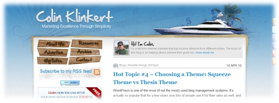
Today I’d like to tell you about the changes I recently made to my blog. It’s the first blog redesign I attempt (for this particular blog) and I must say I’m pretty happy with the end result. Most of you who visit my blog regularly must have noticed the changes already. I made changes to the navigation menu, about box, layout and footer. I also changed the RSS feed button and added an opt in box (make sure you download my new ebook by the way, simply enter your email address in the opt in form on the left). With these changes, it should be much easier for you to navigate throughout the blog. For those who have never visited the blog before, here is how it once looked:

The navigation menu was on the left side and the about box on the top. I really liked this navigation menu but wanted to add more links (to new pages of the blog, some are still under construction at the time this blog post is published). I also wanted the content to appear higher on the page and the opt in box to show up high in the sidebar. I didn’t make all those changes myself but got a designer / programmer to do it for me… and I’m very happy with his work! I had everything in mind before though.
If you scroll down, you will also notice that the layout has changed. In the past the home page was showing the ten latest blog posts (in their full version). Only one full blog post shows up at the top now, followed by two abstracts and a few archived posts. You don’t need to scroll down during hours anymore to find out what the previous blog posts are about. It is now much easier to find the blog posts that most interest you. I also added a testimonial… and there are more coming.
I’m pretty sure these changes will significantly improve the usability and I hope the new layout will help me grow the community I want to create on this blog. I’m sure these changes will make a difference! Anyhow, I hope you like the new design! Feel free to leave your feedback. A few weeks ago I also changed the design of my help desk, check out the following blog post for more info: Reply2Colin: New Design for Better Usability!


 I'm an avid fan of your blog, and the content is always top notch - great reading. I'm always impressed with the variety of content and the way you get all the important steps outlined for processes, but still manage to keep it short and simple - few people do that quite as well.
 Mike Purvis
 Andy Fletcher
 Todd Gross
Leave a Reply